Skip the intro · jump to the list ↓
By the end of this list you’ll have a whole folder of wallpapers ready to swap in whenever the mood hits. No design skills needed, promise!
These got picked after scrolling through way more pins than I’d like to admit. Anything blurry, oddly cropped or impossible to actually find got tossed out immediately.
What made the final cut? Wallpapers that look good behind real icons, not just in a perfect screenshot with zero apps showing.
Some of these lean seasonal, some are more about the whole home screen setup. Widgets, icon color, even the clock font all play a part here.
Are you the type who changes your wallpaper the second the weather shifts? Same! This list has something for basically every mood and every month.
Save the ones that catch your eye and swap them in whenever your phone needs a little refresh. It genuinely takes two minutes, lol!
SEASONAL WALLPAPER IDEAS PHONE
Fresh Spring Florals Wallpaper
Nothing says a fresh start like soft pink blossoms taking over your lock screen. These these lovers screenshot the most tend to feature pastel florals with a little breathing room around the edges.
Pick one with negative space near the top so your clock doesn’t fight with a flower for attention.
- Petal soft, zero clutter
- Looks fresh for a whole season
- Plays nice with pastel icons
Bright Summer Beach Wallpaper
How dreamy is a wallpaper that’s basically an ocean view every time you check the time? Bright turquoise water with a strip of sand at the bottom feels like a mini vacation.
This works especially well if your icons are white or pastel, since they pop right against the blue.
It’s the kind of background that makes a Monday feel a little less Monday, haha!
- Beach day, every time you unlock
- Bright without feeling loud
- Pairs well with white icons
Snowy Winter Wonderland Wallpaper
This one’s for anyone who gets genuinely giddy over the first snowfall. A quiet snowy landscape or a close up of snowflakes makes the whole screen feel calm and cold in the best way.
Add a blue tinted weather widget underneath and the whole setup looks intentional instead of thrown together.
- Quiet, cold, kind of magical
- Cozy without looking busy
- Great with blue toned widgets
Golden Harvest Season Wallpaper
Amber, rust and deep orange tones show up everywhere once the leaves start turning. A wallpaper full of golden fields or falling leaves gives your phone that cozy sweater weather feeling year round.
It’s not just for October either. This palette works well straight through late fall, honestly.
- Rust tones that never go out of style
- Warm without being dark
- Matches wood grain icon packs
Festive Holiday Season Wallpaper
Twinkling lights, deep red backgrounds, maybe a little snow dusted on top. This is the wallpaper equivalent of a cup of cocoa, honestly.
It works great for that stretch between Thanksgiving and New Year’s when everything feels a little sparklier.
Not that I’m biased toward anything with string lights on it, haha!
- The most sparkle on this list
- Pairs well with gold accents
January Fresh Start Wallpaper
January deserves better than a leftover holiday wallpaper still sitting on your screen. A crisp white or pale blue background with a simple word like new or begin sets the tone for the whole year.
These monthly wallpaper ideas are perfect if you like your phone to feel like a tiny reset button on the first of each month.
- A clean slate for January
- Simple enough to look intentional
- Works with any icon color
June Sunshine Vibes Wallpaper
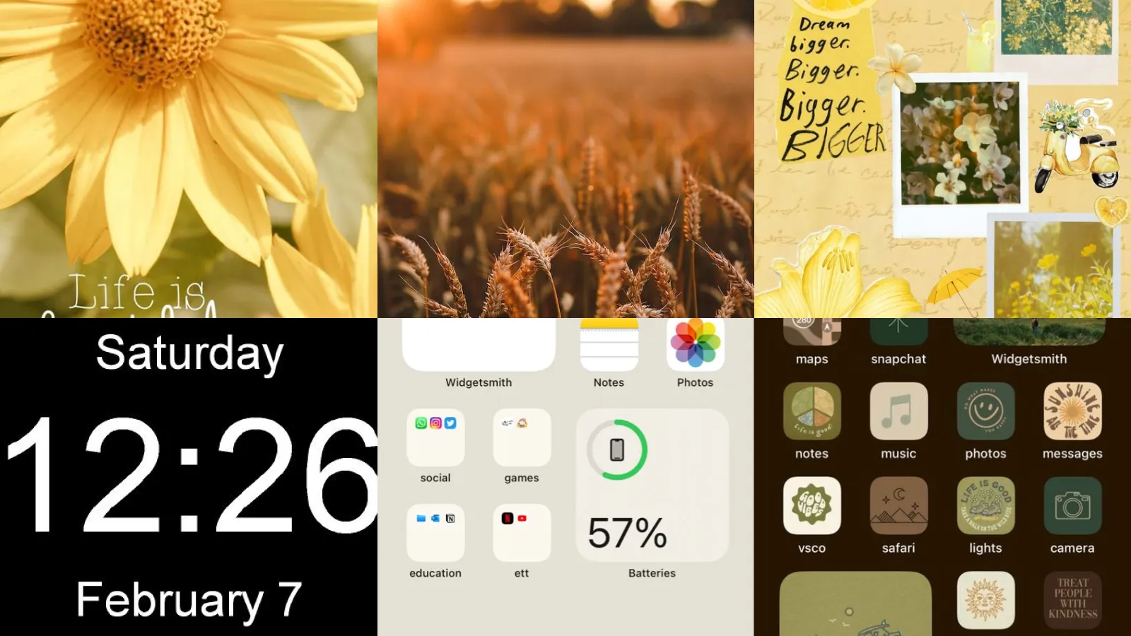
This one is basically sunshine in wallpaper form. Bright yellows and warm citrus tones show up a lot here. They somehow make everything feel a little more relaxed.
It’s an easy swap for the start of summer break, no matter your age, lol!
- Sunshine you can screenshot
- Instantly brightens the home screen
- Pairs nicely with citrus toned widgets
December Snowflake Calendar Wallpaper
A little calendar grid dotted with tiny snowflakes turns your wallpaper into an actual countdown. It’s cute, it’s functional. It makes checking the date oddly satisfying.
Print versions exist too if you’re into that whole aesthetic for a planner or journal.
- Countdown that doubles as decor
- Doubles as a visual countdown
Coordinated Weather Widget Wallpaper
This is where matching wallpaper and widgets ideas really shine. Pick a wallpaper with a soft cloud print, then set your weather widget in a matching pastel frame so the two blend right into each other.
It sounds fussy, but it takes about five minutes once you know which widget app to use.
The end result looks like the wallpaper and the widget were designed together, even if they weren’t.
- Weather that matches the mood
- Works with most widget apps
Matching Clock And Wallpaper
A round analog clock widget sitting right in the center of a wallpaper with a matching circular design just works. There’s something satisfying about shapes lining up like that.
Try a wallpaper with a subtle circular pattern behind the clock face for the cleanest look.
- Shapes that actually line up
- Clean and easy to set up
- No design software needed
Color Coded Widget Layout
Ever notice how satisfying it is when every widget on your screen shares one color family? Sage green weather, sage green calendar, sage green clock, all sitting on a soft sage wallpaper.
It takes a bit of hunting through widget apps to find the right shade, but once it’s done the whole screen feels put together.
This is the setup that gets the most questions when someone borrows your phone, honestly.
- One color, every widget
- Feels custom made
- Great starter palette is sage green
Simple Monochrome Home Screen
Black and white photography or a simple gray gradient makes a home screen look instantly calmer. There’s no color competing for attention, so your eyes just land on whatever app you actually opened your phone for.
This is one of the easiest minimalist phone setup ideas to copy since it barely requires any editing at all.
- One tone, less visual noise
- Almost no editing required
- Works with black and white icons
Clean White Icon Layout
A plain white or cream wallpaper with matching white icon covers turns even the busiest home screen into something that looks like a magazine spread.
Not going to lie, this one takes a bit of patience since you have to cover every single app individually. Worth it though!
- White on white, done right
- Takes patience but looks bakery clean
- Best with a light wallpaper base
Hidden App Icons Setup
Who says every app needs to be sitting out in plain view? Hiding most icons behind a single tap gesture leaves your wallpaper front and center, which is honestly the whole point of picking a nice one.
This setup uses shortcut apps or a simple folder trick, depending on your phone.
- Lets the wallpaper be the star
- Great for phone screenshots
Dark Moody Aesthetic Theme
Deep charcoal backgrounds, moody skies, maybe a single dramatic tree silhouette. This is for anyone whose favorite candle scent is literally called midnight, lol!
It pairs beautifully with dark mode icons if your phone supports the setting.
Not everything has to be bright and cheerful. Honestly this one has range.
- Midnight energy, all screen long
Boho Earthy Aesthetic Theme
Last but definitely not least, we have this earthy boho look. Terracotta, rattan textures and dried florals make up most phone aesthetic themes ideas in this category. They never seem to go out of style.
It looks especially good with warm wood grain widgets sitting on top.
This is the setup that quietly outlasts every trend that comes after it.
- Terracotta that never fades
- Warm tones fit any month
Just a little note - some of the links on here may be affiliate links, which means I might earn a small commission if you decide to shop through them (at no extra cost to you!). I only post content which I'm truly enthusiastic about and would suggest to others.
And as you know, I seriously love seeing your takes on the looks and ideas on here - that means the world to me! If you recreate something, please share it here in the comments or feel free to send me a pic. I'm always excited to meet y'all! ✨🤍
Xoxo Isabella