Skip the intro · jump to the list ↓
Staring at your camera roll with a hundred good photos and zero idea how to edit them? Same. That scroll fatigue is real. It usually ends with you closing the app and doing nothing, lol!
This list exists to fix exactly that problem. Instead of forty tabs open at once, you get sixteen clear directions to pick from.
Each idea here got pulled from hundreds of saved pins and only the ones that actually work on a regular phone photo made the cut. No fancy studio lighting required, I promise!
Some lean moody, some lean soft and dreamy, some go full vintage. A few take thirty seconds in a free app and a few ask for a little more patience.
Whatever your photos need, there’s a direction in here for it. Pick one style, try it on five photos and see how it feels before jumping to the next.
Ready to make your feed look like it actually has a theme for once? Let’s get into it.
PHOTO EDITING IDEAS AESTHETIC
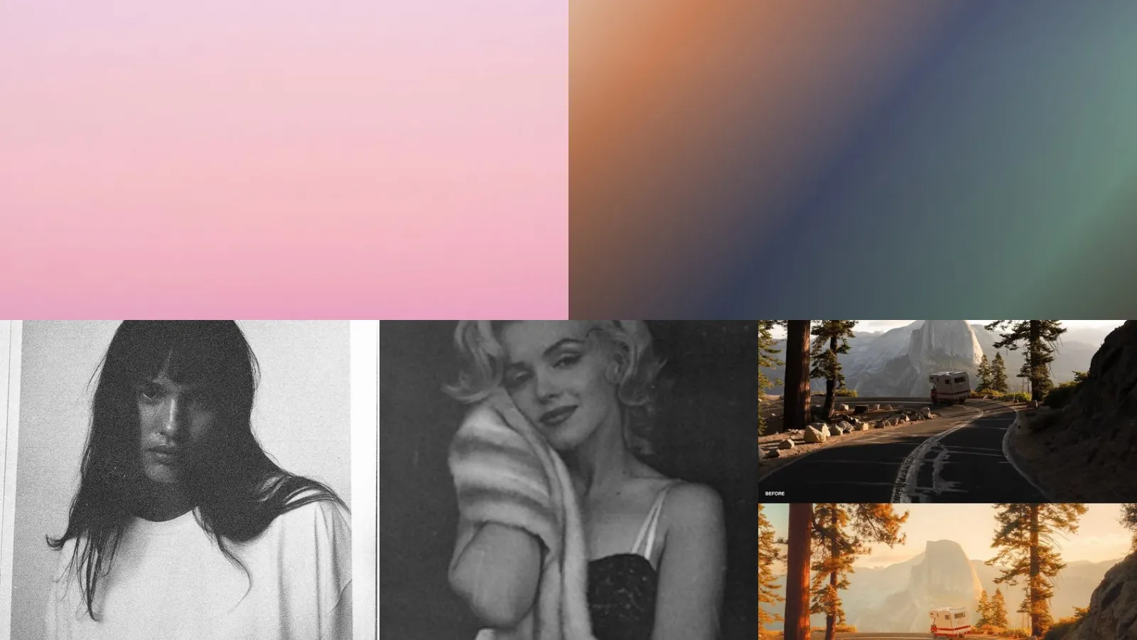
Dreamy Pastel Color Tones
Pastel tones make everything feel a little softer and a little sweeter. Pull the saturation down just slightly and shift the whites toward pink or lavender instead of pure white.
It works best on photos with soft light already, like an overcast morning or a shaded porch. Skip it on anything with harsh shadows, they fight the pastel vibe every time.
- Soft over saturated always
- Works great on overcast days
- Skips harsh midday shadows
Soft Golden Hour Glow
Nothing beats that warm honey light right before sunset. If you missed the actual golden hour, you can fake it pretty convincingly.
Add a warm orange tint to the highlights and dial the shadows toward a deep amber. It tricks the eye every single time, haha!
- Fakes the light beautifully
- Best on portraits and pets
- Warms up flat gray days
Moody Dark Aesthetic Edit
This one leans into shadow instead of running from it. Crush the blacks down, pull the highlights back and let the color palette go a little green or teal.
Moody edits work great for coffee shots, rainy windows and anything with texture. Not every photo needs to be bright and cheerful, am I right?
- Shadows do the talking
- Great for rainy day photos
- Loves texture and grain
Aesthetic Black And White Contrast
Black and white photos still stop the scroll. The trick is contrast, not just draining the color out and calling it a day.
Push the blacks darker and the whites brighter so the image has real depth to it. A flat gray photo looks tired. A contrasty one looks intentional.
- Contrast over flat gray
- Works on architecture and faces
- No color decisions needed
Warm Sunset Filter Look
Warm sunset filters slap an orange and pink wash over everything and somehow it just works. This is the easiest one on the entire list, honestly.
Most editing apps have a preset already built for this. Bump the warmth up a notch further than feels natural and it usually looks perfect.
- The lazy Sunday filter
- One tap in most apps
- Great for beach and travel shots
Clean Minimal White Edit
Clean minimal edits are having a real moment right now. Bright whites, soft shadows, almost no color grading at all.
This one flatters flat lays, product shots and anything on a white background. It looks easy but it takes a careful hand with the exposure.
- Barely there but polished
- Best for flat lays and product shots
- Boosts brightness without blowing highlights
Faded Nostalgic Color Palette
Faded colors give a photo that lived-in, found-in-a-drawer kind of feeling. Lower the contrast, lift the blacks slightly and let the colors go a touch dusty.
It reads nostalgic without screaming vintage filter. This is the edit I reach for on photos from the orchard trip every single fall.
- Lived-in over polished
- Lifts blacks for a soft haze
- Pairs well with muted florals
Cottagecore Soft Aesthetic Edit
Cottagecore edits go soft, warm and a little hazy, like sunlight through a lace curtain. Green tones lean toward sage instead of bright grass. Whites go slightly cream.
Think garden photos, homemade bread and old wooden furniture. It’s the softest, coziest style on this whole list, lol!
- Sage over bright green
- Perfect for garden photos
- Turns whites slightly cream
Warm Earthy Preset Tones
If you want one look you can use on every photo, a warm earthy preset is the answer. Think terracotta, olive and warm browns running through the whole feed.
These preset style ideas save so much time because you apply one filter and adjust the exposure instead of starting from scratch on every single photo.
- One preset, whole feed
- Terracotta and olive undertones
- Adjust exposure and move on
Grainy Texture Portrait Edit
Grain adds texture to a portrait that feels a little too smooth or digital. It fakes the look of shooting on real film without owning a single roll of it.
These grainy photo edit ideas work especially well on close-up portraits where skin can otherwise look overly airbrushed.
- Texture over airbrushed skin
- Fixes overly smooth portraits
- No film camera required
Noisy Analog Style Photo
Analog style leans further into the grain and adds a slight color shift too, usually toward green or yellow. It looks like it came off a disposable camera from a gas station in 2004.
This works great for candid shots, group photos and anything a little imperfect on purpose.
- Disposable camera energy
- Slight green or yellow shift
Grainy Black And White Look
Black and white with grain is a completely different mood than clean black and white. It feels older, rougher, a little more honest somehow.
Add grain after converting to black and white, not before, or the texture gets muddy and loses its punch.
- Rougher than plain black and white
- Add grain after converting
Old Hollywood Vintage Edit
Old Hollywood glamour is all soft focus, warm highlights and a slight golden tint over the whole frame. It flatters portraits especially well, almost like a spotlight is following the subject around.
These vintage edit ideas photos borrow heavily lean on soft light and a little haze around the edges of the frame.
- Spotlight in every frame
- Golden tint on highlights
- Soft haze around the edges
Sepia Toned Vintage Photo
Sepia is the classic, the one everybody thinks of first when they hear the word vintage. Warm browns replace all the color. It works on nearly anything.
It looks especially good on photos with a lot of texture like wood, brick or old paper.
- The original vintage go-to
- Warm browns replace all color
- Loves wood and brick textures
Classic 35mm Film Effect
35mm film has that soft, slightly imperfect look that digital photos rarely get on their own. Colors shift slightly warm, contrast softens and there’s a subtle vignette around the edges.
These film look edit tips work best when you resist the urge to sharpen the photo afterward. Film was never that crisp to begin with. That’s the whole charm.
- Skip the sharpening step
- Subtle vignette on the edges
- Warm shift instead of neutral
Muted Film Color Grade
Last but definitely not least, we have the muted film color grade. Colors get pulled way back so nothing screams for attention. The whole photo feels calm.
It works beautifully on travel photos with a lot going on in the frame. Not every color needs to fight for the spotlight. This proves it, lol!
- Calm over color chaos
- Best for busy travel shots
Just a little note - some of the links on here may be affiliate links, which means I might earn a small commission if you decide to shop through them (at no extra cost to you!). I only post content which I'm truly enthusiastic about and would suggest to others.
And as you know, I seriously love seeing your takes on the looks and ideas on here - that means the world to me! If you recreate something, please share it here in the comments or feel free to send me a pic. I'm always excited to meet y'all! ✨🤍
Xoxo Isabella
✨ Wait! Your next favorite is right here
These are the posts readers open next. See why: