Skip the intro · jump to the list ↓
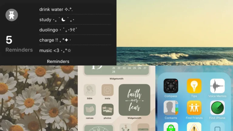
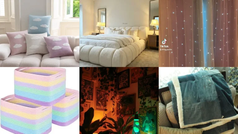
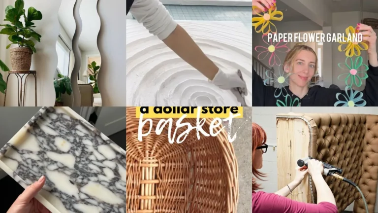
Spooky season and cozy season both bring the same little habit: everyone suddenly wants a phone that matches the mood, lol!
Most people grab a random wallpaper, drop widgets wherever. Call it done. That’s honestly the biggest mistake, because a homescreen thrown together in thirty seconds never feels calm to look at.
I scrolled through hundreds of pins to put this list together and only kept the setups that actually work on a real phone screen. No layouts that need fifteen apps you’ve never heard of.
Below you’ll find 18 ideas that range from moody and dark to soft and pastel, plus a few that lean nature or vintage. There’s something here whether you check your phone forty times a day or just want it to look nice in photos.
Each idea includes the small details that make it work, so you’re not left guessing. Under most of them you’ll also find a link to the full step-by-step so you can recreate it exactly.
Ready to make your homescreen feel a little more put together? Let’s get into it.
IPHONE HOMESCREEN LAYOUT IDEAS AESTHETIC
Minimalist Beige Homescreen Layout
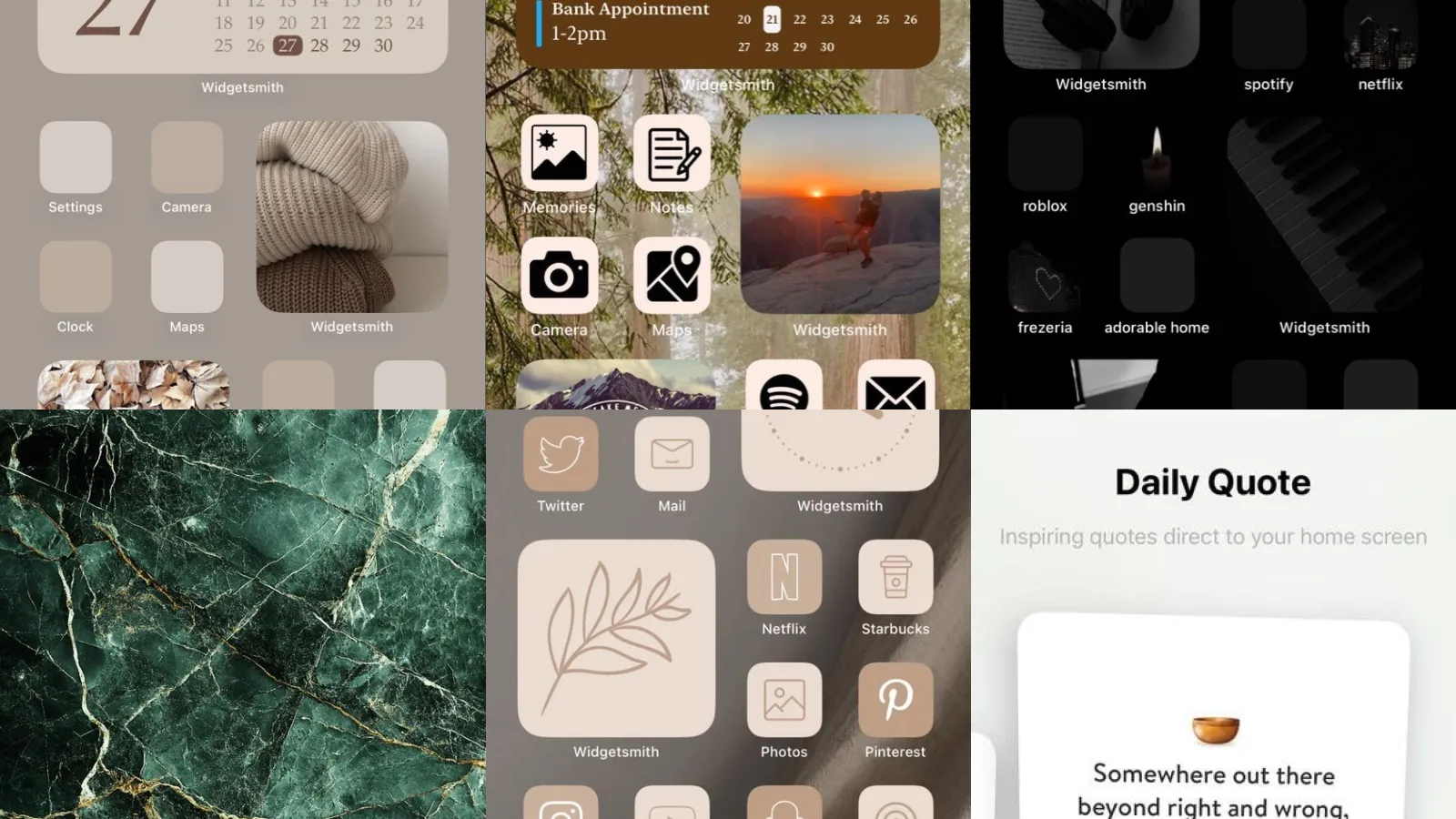
This beige homescreen layout is proof that neutral doesn’t mean boring. Every icon sits on a soft cream background so the whole screen feels like one calm surface instead of forty tiny billboards.
Group your most-used apps into a single row up top and hide the rest in folders below. It looks tidy within minutes.
- Calm over chaotic
- Works with any cream wallpaper
- Folders hide the messy things
Dark Mode Aesthetic Homescreen
Dark mode isn’t just for saving battery anymore. Black backgrounds with white or gold icon outlines make everything feel sleek. Honestly a little expensive.
The trick is keeping contrast low so nothing screams for attention. It just glows a little in the dark.
- Sleek after sundown
- Easier on tired eyes
- Gold accents feel a little fancy
Pastel Pink Homescreen Setup
Pastel pink setups are having a real moment. I get why. It’s soft, it’s cheerful. It somehow makes checking email feel less like a chore.
Pair a blush wallpaper with rounded custom icons for the full effect. This one photographs beautifully too.
- Soft and cheerful
- Blush tones only
- Rounded icons soften everything
Nature Inspired Homescreen Design
Nature inspired homescreens lean on greens, browns. Photos of leaves or moss. It brings a little outside energy into a screen you stare at all day.
A wallpaper of tree bark or forest fog works surprisingly well here. Not that I’m obsessed with forest photography or anything, lol!
Keep the icon colors earthy so nothing clashes with the background.
- Bring the outdoors in
- Earthy tones throughout
- Works with almost any nature photo
Boho Chic Homescreen Layout
Boho chic setups mix warm terracotta, rattan textures. Little sun or moon icons. It’s the phone equivalent of a well decorated apartment.
Layer in a widget or two with a woven texture background. The whole thing feels lived-in without looking messy.
- Warm and a little wild
- Terracotta and rattan tones
- Pairs well with woven widgets
Clean Grid Homescreen Arrangement
A clean grid arrangement is for people who like order more than personality. There’s no shame in that. Everything lines up in perfect rows with even spacing between icons.
This layout works with literally any color scheme. It just needs consistency more than anything else.
- Straight lines only
- Even spacing top to bottom
- Any color palette works
Vintage Film Homescreen Style
Vintage film style homescreens use grainy photo wallpapers and slightly faded icon tones. It looks like a screenshot from an old camera roll, in the best way.
Add a warm filter to your wallpaper before uploading it. The whole screen instantly feels nostalgic.
- Grainy and nostalgic
- Warm filtered wallpaper
Monochrome Black Homescreen Setup
Monochrome black setups are dramatic, moody. Honestly a little bit cool. Every icon gets recolored to black or deep charcoal so the screen reads as one unit.
It takes some patience to recolor that many icons. Worth it though, because the end result looks custom-built.
- All black everything
- Charcoal icon set
- Reads as one solid unit
Soft Cloud Wallpaper Design
Soft cloud wallpapers are dreamy without trying too hard. Pale blues and whites blend into each other. It makes the whole phone wallpaper ideas aesthetic feel light and airy.
They pair well with pastel or white icons. This is the one I’d pick for a phone that needs to feel calmer.
- Light and airy
- Pairs with pastel icons
Retro Sunset Wallpaper Idea
Retro sunset wallpapers bring in orange, pink. Purple gradients that feel like a postcard from the seventies. This one has serious main character energy.
They look great behind warm-toned icons. Pair it with a gold clock widget and the whole thing feels intentional.
- Postcard vibes
- Gradient orange and purple
- Pairs with gold accents
Marble Texture Wallpaper Inspiration
Marble texture wallpapers are the closest thing to a luxury upgrade that costs absolutely nothing. White and grey veining looks classy against almost any icon color.
It works especially well with black or gold icon sets. Simple, elegant. It never really goes out of style.
- Luxury for free
- White and grey veining
Calendar Widget Lock Screen
A calendar widget on the lock screen keeps your week visible without opening a single app. Tap once and there’s the whole month staring back at you.
This is one of those lock screen widget layout ideas that actually saves time instead of just looking pretty. Place it right under the time for easy glancing.
- Your week at a glance
- No app tapping required
- Sits neatly under the clock
Weather Widget Lock Screen Layout
Weather widgets on the lock screen mean no more guessing if you need a jacket. It just sits there, quietly doing its job.
Pair it with a small clock widget beside it for balance. Two small widgets look neater than one giant one.
- Jacket or no jacket
- Balances with a small clock
- Updates automatically all day
Photo Widget Lock Screen Idea
A photo widget turns your lock screen into a tiny rotating gallery. Every unlock shows a different picture, which honestly makes checking the time more fun than it should be.
Load it with pictures from a recent trip or even just your dog. It never gets old.
- A tiny rotating gallery
- Different photo every unlock
- Great with travel pictures
Custom Neutral App Icons
Custom neutral icons are the fastest way to make a homescreen look cohesive. Swap the loud default icons for soft beige or white versions and the whole screen instantly calms down.
This falls squarely into app icon aesthetic ideas territory. It’s one of the easier upgrades on this whole list. It just takes a little patience assigning each one.
- Quiet icons only
- Beige or white icon packs
- Takes about an hour to set up
Color Coded App Folders
Color coded folders group apps by category and by shade at the same time. Reds together, blues together. Suddenly your phone looks like it was designed on purpose.
- Sorted by shade
- Groups by color and category
- Makes finding apps faster
Simplified Home Screen Categories
Simplified categories cut the clutter down to just a handful of folders. Think Work, Social. Fun instead of twelve random labels nobody remembers.
This is peak phone organization aesthetic ideas territory because less really is more here. Fewer folders means less time hunting for that one app you swear you downloaded.
- Fewer folders, less stress
- Three or four categories max
- Cuts down on app hunting
Daily Quote Widget Display
Last but definitely not least, a daily quote widget gives your homescreen a little personality boost every morning. It refreshes automatically so you’re never staring at the same words twice.
This is one of those homescreen widget ideas that feels small but actually shifts your whole mood before coffee. Not that I check it every single morning or anything, haha!
- A little morning nudge
- Refreshes daily on its own
Just a little note - some of the links on here may be affiliate links, which means I might earn a small commission if you decide to shop through them (at no extra cost to you!). I only post content which I'm truly enthusiastic about and would suggest to others.
And as you know, I seriously love seeing your takes on the looks and ideas on here - that means the world to me! If you recreate something, please share it here in the comments or feel free to send me a pic. I'm always excited to meet y'all! ✨🤍
Xoxo Isabella