Skip the intro · jump to the list ↓
By the end of this list you’ll have a whole wall plan ready to go, lol! No more staring at blank space above the couch wondering what to do with it.
These ideas came from scrolling through way too many pins over way too many nights. Only the ones that actually work in a everyday home made the cut.
So nothing that needs a professional framer or a wall the size of a gallery. Just doable, budget-friendly setups anyone can pull off.
Some lean into color and chaos. Others keep things quiet with one perfect print and a lot of white space.
Pick whichever matches your room’s mood right now. You can always swap things out later, no commitment required!
Grab a few frames, some washi tape and maybe a Sunday afternoon. Let’s get into it.
POSTERS AESTHETIC IDEAS
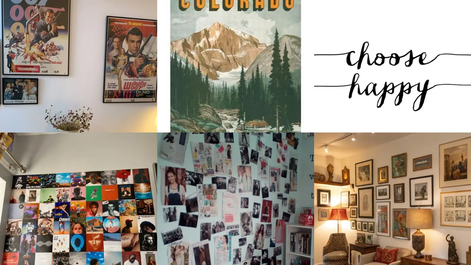
Vintage Movie Poster Corner
We’re starting off strong with the vintage movie poster corner. Faded colors and old-school fonts give a whole wall instant character.
Thrift stores are basically a goldmine for these if you know where to look. Even reprints look convincing once they’re framed up.
- Thrift store treasure hunt
- Frames from the craft aisle work great
- Faded colors read as vintage instantly
Dreamy Pastel Poster Wall
How dreamy is this pastel poster wall? Soft pinks, lilacs and mint greens make these feel calm instead of cluttered.
This works best when every print shares a similar tone. Mixing warm pastels with cool ones tends to look muddy.
- Soft palette, big payoff
- Sticks to three shades max
- Looks great in a small bedroom
Minimalist Black And White Posters
Black and white posters are the easiest way to look put together fast. There’s zero color matching to stress over, which honestly feels like a relief.
A grid of moody photography prints or simple line drawings never goes out of style. This is the safest pick if you’re renting and worry about resale value.
Retro Travel Poster Display
Retro travel posters bring a whole trip’s worth of nostalgia into one wall. Think old airline art, national park prints and vintage city skylines.
They pair surprisingly well with wood frames instead of sleek metal ones. It gives the whole thing a lived-in, well-traveled feel.
- Wanderlust without the plane ticket
- Wood frames add warmth
- National park prints are a classic start
Botanical Line Art Posters
Botanical line art keeps things simple and a little bit fancy. Single continuous lines tracing leaves and flowers look like something from a design magazine.
These work in almost any room, honestly. A kitchen, a hallway, even a bathroom above the towel rack.
- Fancy without trying too hard
- Works in a hallway or bathroom
- One line, endless shapes
Grunge Poster Bedroom Wall
Who says a grunge wall has to look messy? This one leans into torn edges, safety pins and layered tape on purpose.
Band posters, ripped paper and dark tones all pile together here. It’s chaotic in the best way and honestly kind of fun to build, haha!
- Organized chaos, basically
- Torn edges are the whole point
- Layer with washi tape for texture
Bold Statement Typography Print
Bold statement typography prints are for anyone who wants their wall to say something, literally. One big word or a punchy phrase in a huge font does all the work.
These typographic print ideas look best with a lot of empty space around them. Crowding a bold word takes away its whole punch.
- One word, maximum impact
- Best hung with plenty of breathing room
- A single frame makes a statement
Handwritten Quote Wall Art
Handwritten quote prints feel more personal than a printed font ever could. Something scribbled in loose cursive looks like a note from a friend, not a store display.
Not that I’m picky about fonts or anything, haha! But this style genuinely warms up a cold room fast.
- Feels like a note, not a poster
- Loose cursive beats a stiff font
- Pairs nicely with a plain frame
Minimal Serif Word Print
Minimal serif word prints keep it classy without trying too hard. A single word in a clean serif font, centered on cream paper, is basically foolproof.
This is the print for people who like tidy shelves and matching hangers. No shame in that!
Vinyl Record Cover Display
A vinyl record cover display turns actual albums into wall art. No printing needed, just a few acrylic frames and your favorite covers.
This looks incredible with covers from different decades mixed together. The colors alone usually do the decorating for you.
- The records were already yours
- Acrylic frames keep covers protected
- Mix decades for instant contrast
Grid Layout Album Wall
Album wall ideas aesthetic setups often come down to one thing: symmetry. A tight grid layout of same-size frames feels intentional even with random album covers inside.
Measure twice before you drill a single hole. A crooked grid is honestly worse than no wall art at all.
- Symmetry does the heavy lifting
- A paper template saves the wall
Favorite Albums Gallery Wall
A favorite albums gallery wall is basically a musical autobiography. Pick the records that got you through certain years and let them tell the story.
It’s the kind of wall that starts conversations every single time someone new walks in.
- Your playlist, framed
- Rotate covers by season if you want
- Great above a record player
Vintage Magazine Cutout Collage
A vintage magazine cutout collage is basically a scrapbook that lives on your wall. Old magazine pages, torn headlines and glossy photos all layered together.
Worth it though.
- Scrapbook energy, wall sized
- Old magazines from the thrift bin work perfectly
- Mod podge holds everything down
Fashion Magazine Page Wall
Fashion magazine page wall setups pull straight from old Vogue and Elle issues. Glossy editorial spreads look surprisingly high end once they’re framed in a neat row.
This is one of those magazine wall ideas that costs almost nothing if you already have a stack of old issues lying around.
- Editorial looks for cheap
- Old issues from a closet stack work
- Frame in a straight row for polish
Ripped Magazine Clipping Display
Ripped magazine clippings on display keep the rough edges instead of hiding them. Uneven tears actually add a lot of character here.
Pin them up with washi tape so you can swap pages whenever a new favorite shows up. Nothing here is permanent. That’s kind of the charm.
- Torn on purpose
- Washi tape makes swapping easy
- Rough edges add character
Layered Frame Gallery Mix
A layered frame gallery mix stacks smaller frames slightly overlapping bigger ones. It creates depth that a flat row of matching frames just can’t match.
This print mix ideas wall style rewards a little imperfection. Leave gaps uneven and it looks more put together, not less.
- Depth over perfection
- Uneven gaps look intentional
Textured Print Collage Wall
Textured print collage walls mix flat paper prints with something raised, like woven wall hangings or dried florals. It adds a tactile layer that photos alone can’t give.
The mix of smooth and rough surfaces makes the whole wall feel more interesting up close.
Eclectic Mixed Media Wall
Last but definitely not least, we have the eclectic mixed media wall. Photos, prints, small mirrors and even a postcard or two all live together here.
There’s no strict formula, which honestly makes it the most forgiving option on this whole list. Add pieces slowly over time and watch the whole thing come together.
- Rules optional, personality required
- Add a mirror for extra depth
- Grows piece by piece over time
Just a little note - some of the links on here may be affiliate links, which means I might earn a small commission if you decide to shop through them (at no extra cost to you!). I only post content which I'm truly enthusiastic about and would suggest to others.
And as you know, I seriously love seeing your takes on the looks and ideas on here - that means the world to me! If you recreate something, please share it here in the comments or feel free to send me a pic. I'm always excited to meet y'all! ✨🤍
Xoxo Isabella
✨ Wait! Your next favorite is right here
These are the posts readers open next. See why: